Home
This project needed to communicate a sense of home and stability. The client was setting out to create a nutritional coaching business that would help others learn how to plan meals for themselves to give them the fuel they needed to become stronger and healthier people.
I began by sketching over 72 ideas on grids in my sketchbook. I reviewed them with the client and we centered in on about five possibilities. Strong triangular shapes, paths, and mountains were among the imagery that we thought best represented the idea of Hauora Nutrition.
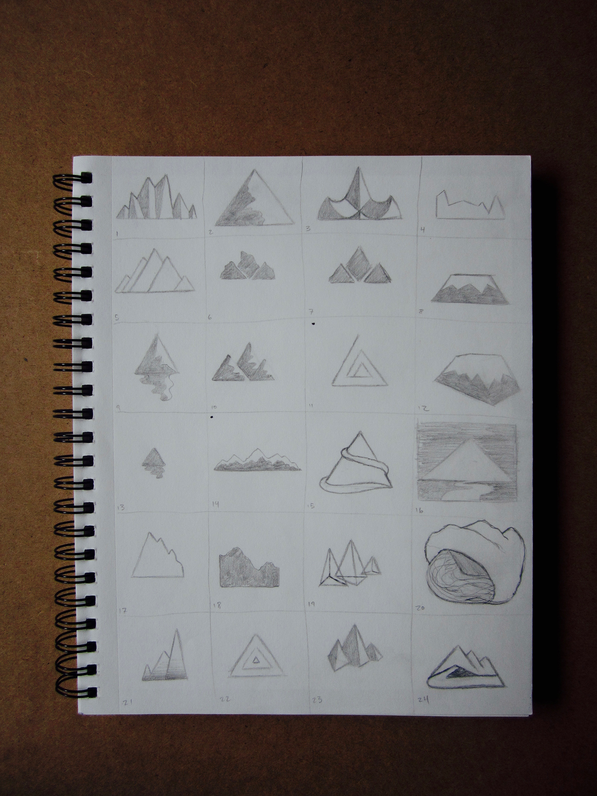
24 of the 72 sketchbook ideas for the Hauora Nutrition logo.
Nine Icons
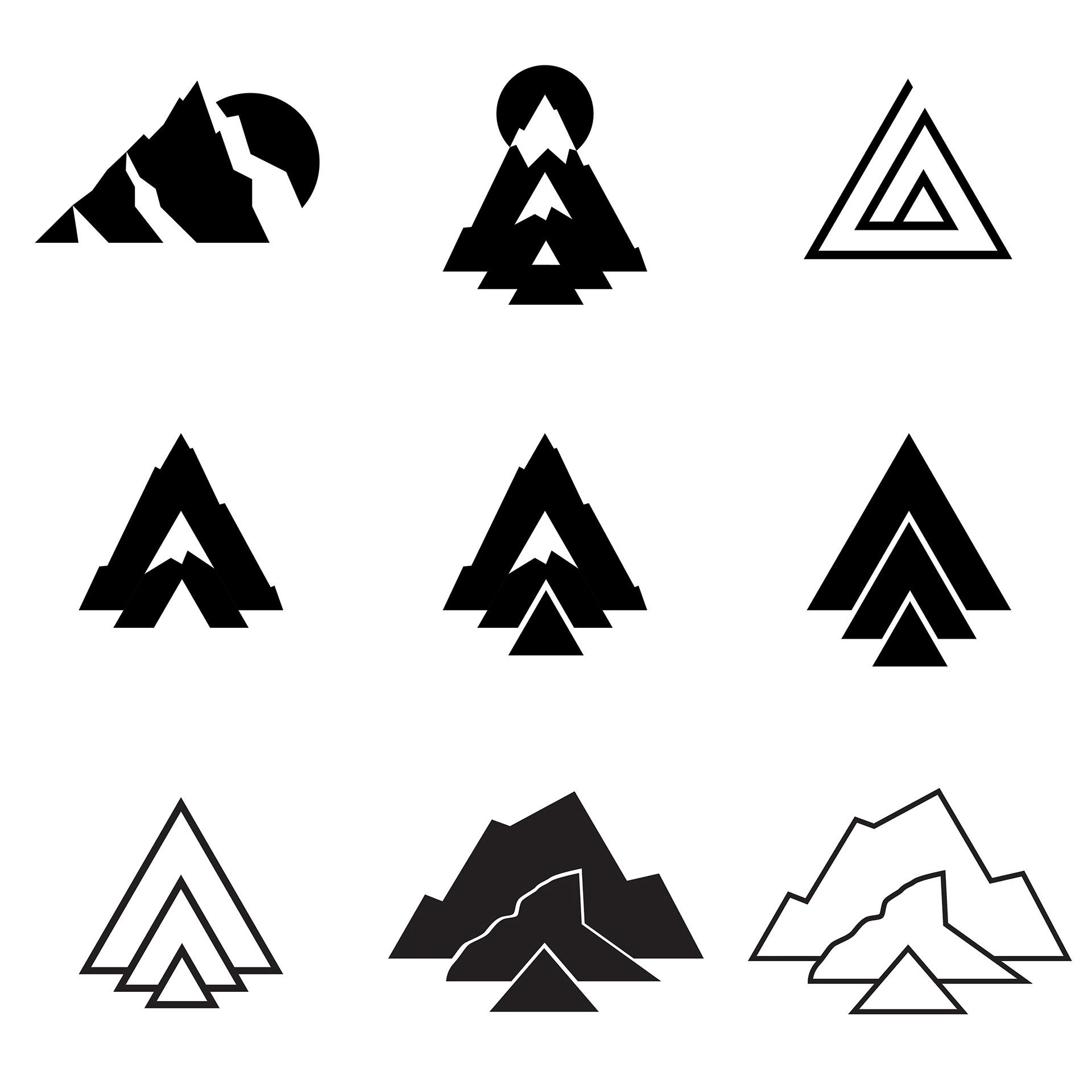
After choosing some sketches to focus on, I used Adobe Illustrator to create nine possible icons for the logo in black and white.
Mountains
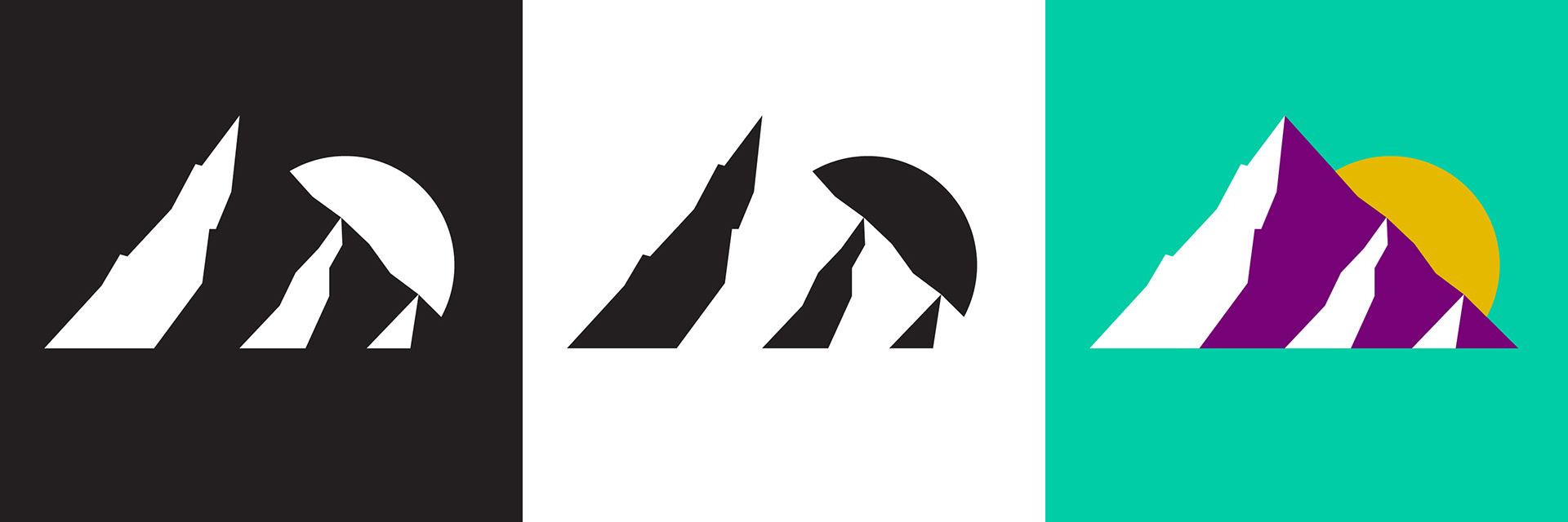
The client was interested in the idea of three mountains together which would represent steps towards achieving a larger goal. I reworked one of the original nine icons and presented it in three colors.
Triangles & Type
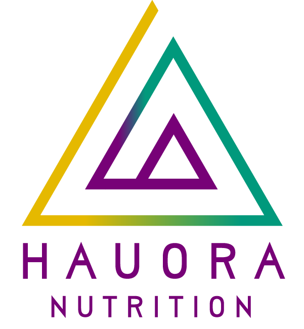
In the end, it was an elegant triangle design that fit the project best. Once I knew what the icon would be, I began experimenting with type. Below is the first attempt sent to the client. It proved to be too blocky and crowded.
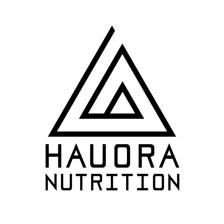
First attempt at type for the logo.
Final Product
Finally, I softened some of the letters and adjusted the kerning so the whole thing could breath better. The client chose colors and I added a gradient to the triangle icon. The final product communicates stability, professionalism, and a path towards improvement.
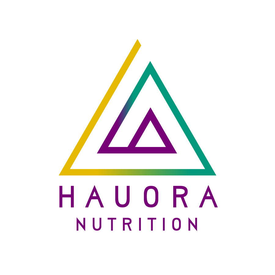
Final main logo with adjusted type.
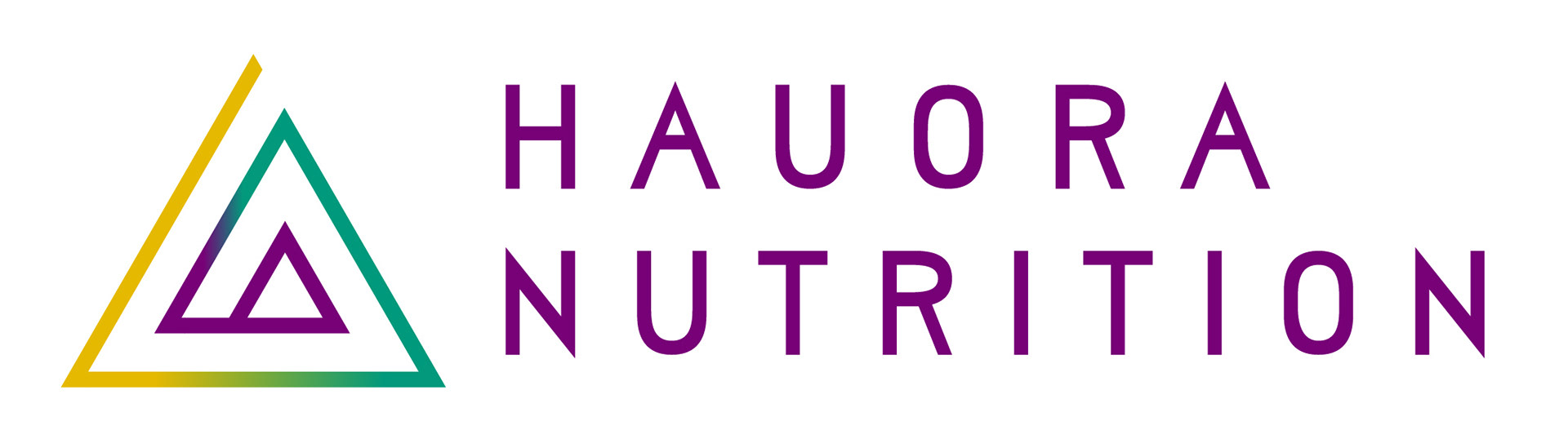
Final banner logo.
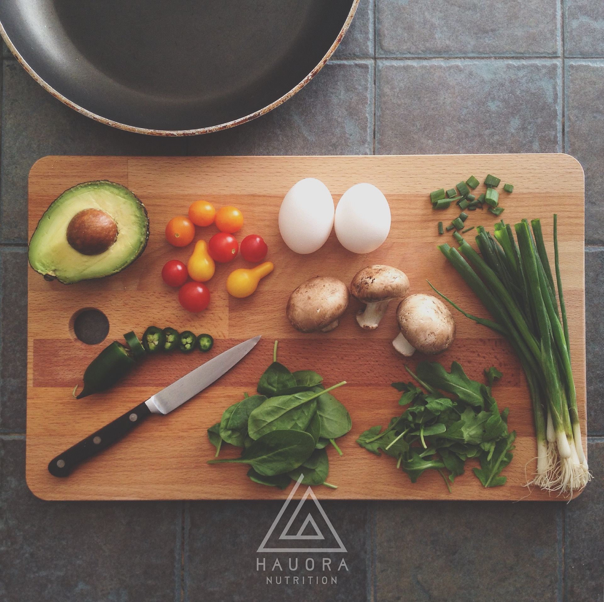
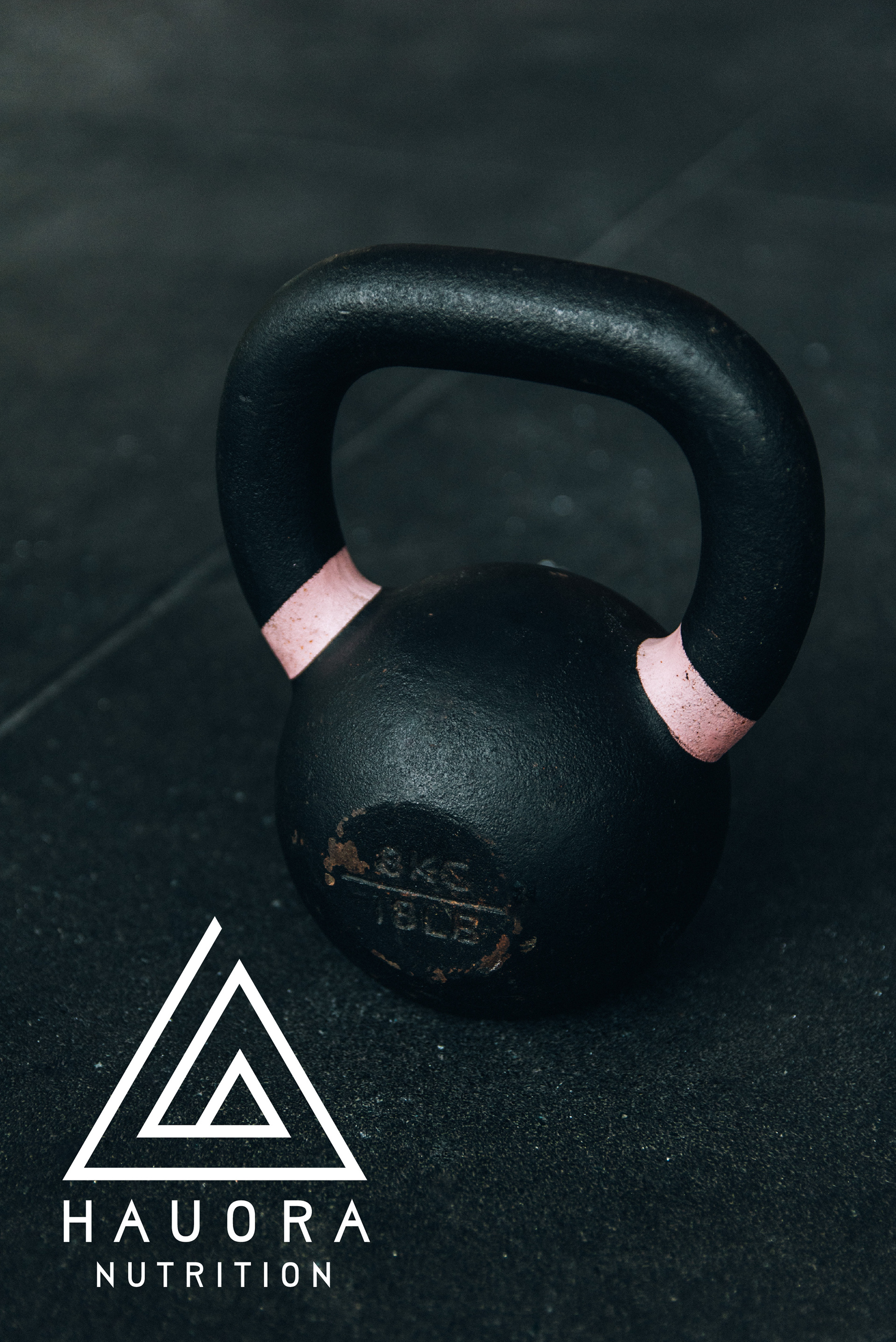
Sample advertisement with stock photo.
Sample advertisement with stock photo.